
Fall Inspired Palettes
Autumn is that wonderful season that transitions us from a buzzing summer to the quiet calm of winter. As daylight hours grow shorter and leaves shed their spring colors for a visually pleasing transition to the oranges and reds of Autumn, mother nature provides ample design inspiration for those considering fall palettes for their interiors.
In our latest seasonal celebration of color, we’re sharing some fresh Farrow & Ball hues that are fueling inspiration for new projects in the Studio and beyond. Elevate your interiors by taking a page from these KRID approved fall color palettes.
1. Ball Green
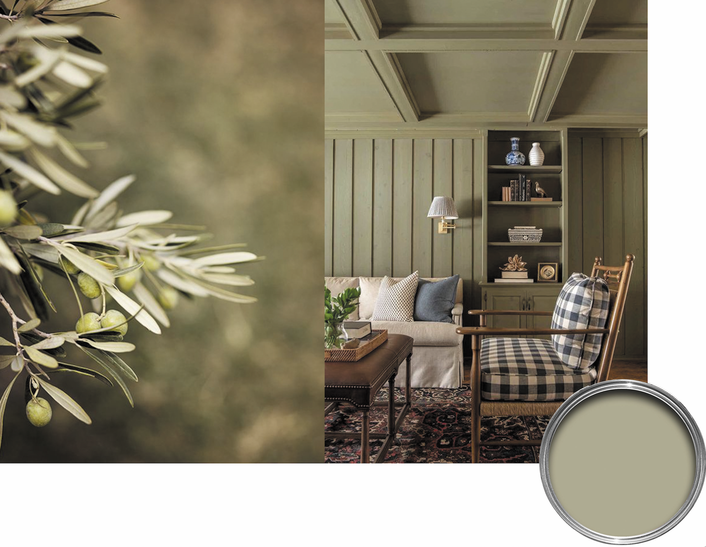
Interior Design by Kipling House Interiors | Farrow & Ball No. 75
This desaturated green has a magical quality of silver undertones – making it a soothing neutral that pairs perfectly with dusky browns and candlelight.
2. Blazer
Interior Design by Kristin Riccio Interior Design | Farrow & Ball No. 212
A mid-fall trip to the woods would likely reveal many trees that have brilliant reds, and this color palette speaks to that. Pair the deep, regal red with the lighter shades for some serious contrast.
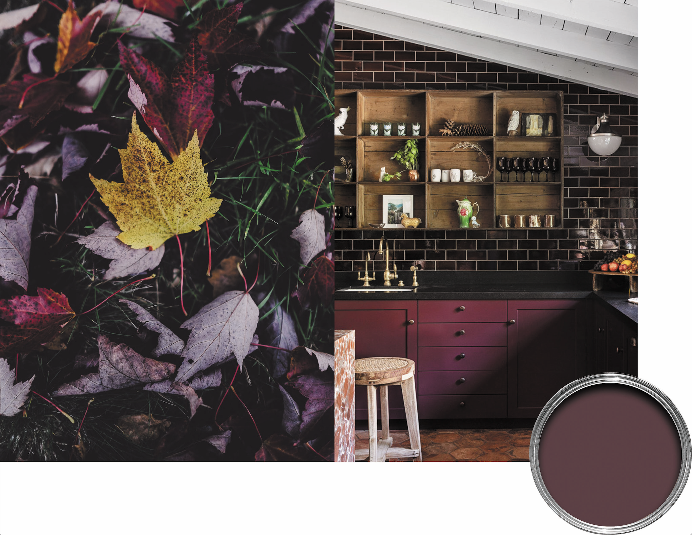
3. Brinjal

Interior Design by Jane Hallworth | Farrow & Ball 222
A rich aubergine that's particularly magnificent in high gloss, this color creates a warm and highly sophisticated finish.
4. Charlotte’s Locks
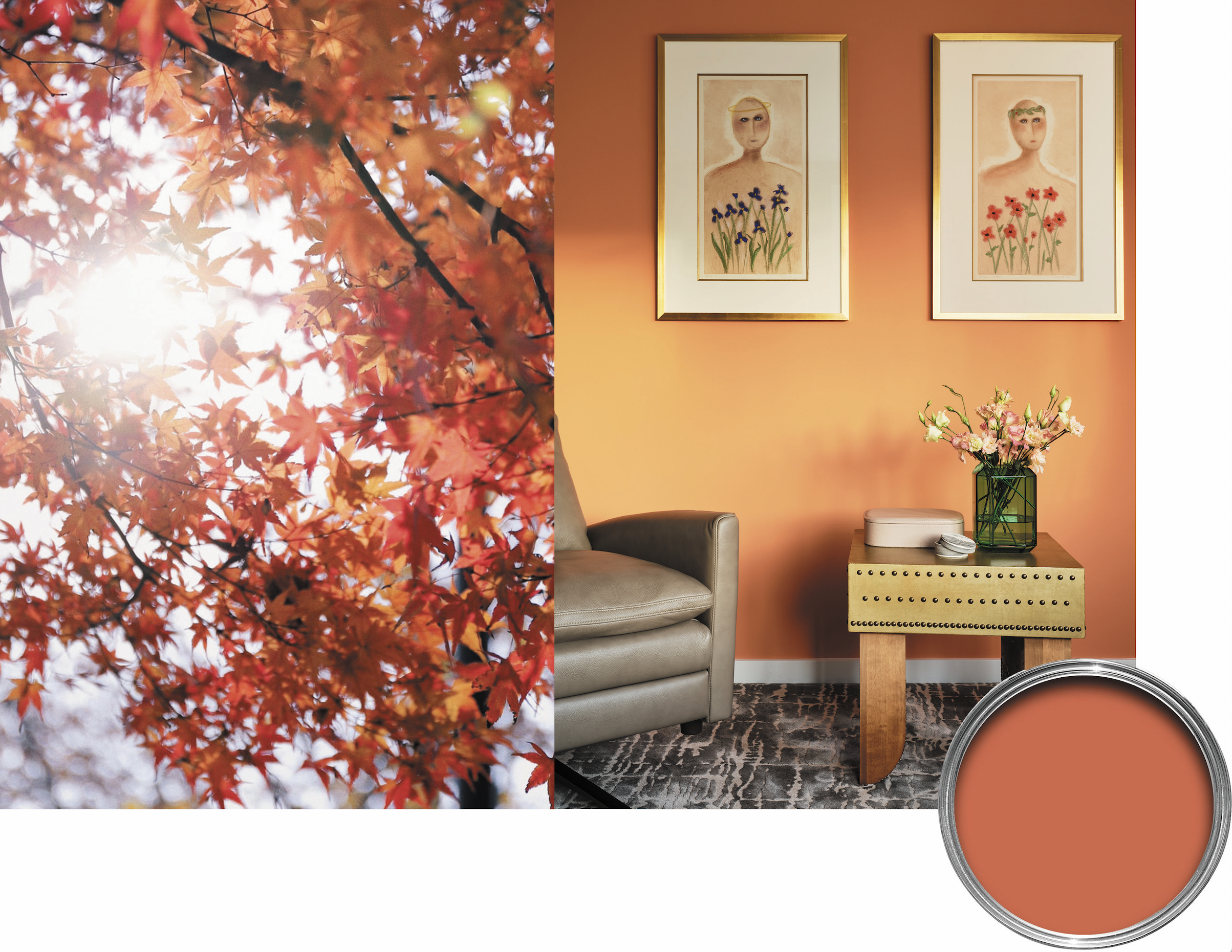
Interior Design by Kristin Riccio Interior Design | Farrow & Ball No. 268
Taking inspiration from the season’s fiery oranges, this deep and dramatic hue lends warmth and coziness to the home.
5. Dutch Yellow
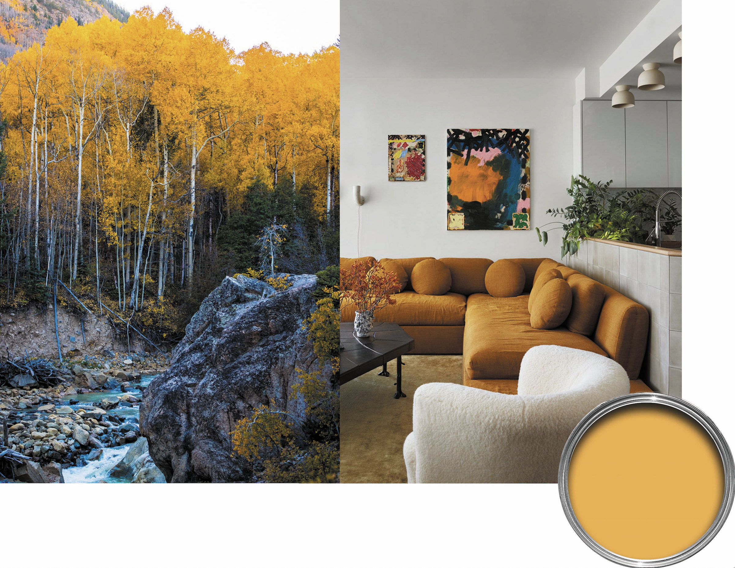
Interior Design by Giancarlo Valle | Farrow & Ball No. W76
With a dynamic quality that brings an enveloping energy to a room, this color marries particularly well with shades of green and milky whites.
6. Stiffkey Blue
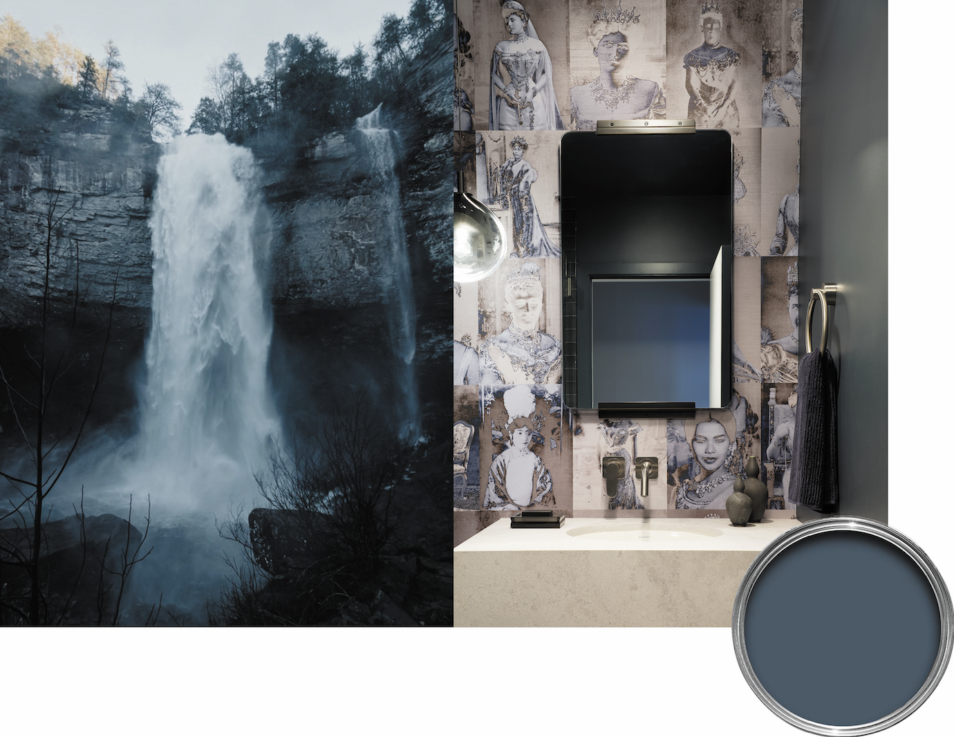
Interior Design by Kristin Riccio Interior Design | Farrow & Ball No. 281
Blue brings on new emotion in the Fall with moody grey-blues hinting at the winter ahead. This deep hue creates a richly dramatic space with a more contemporary edge. Bold blues also work wonderfully when contrasted with fall’s iconic oranges and yellows.
7. Studio Green
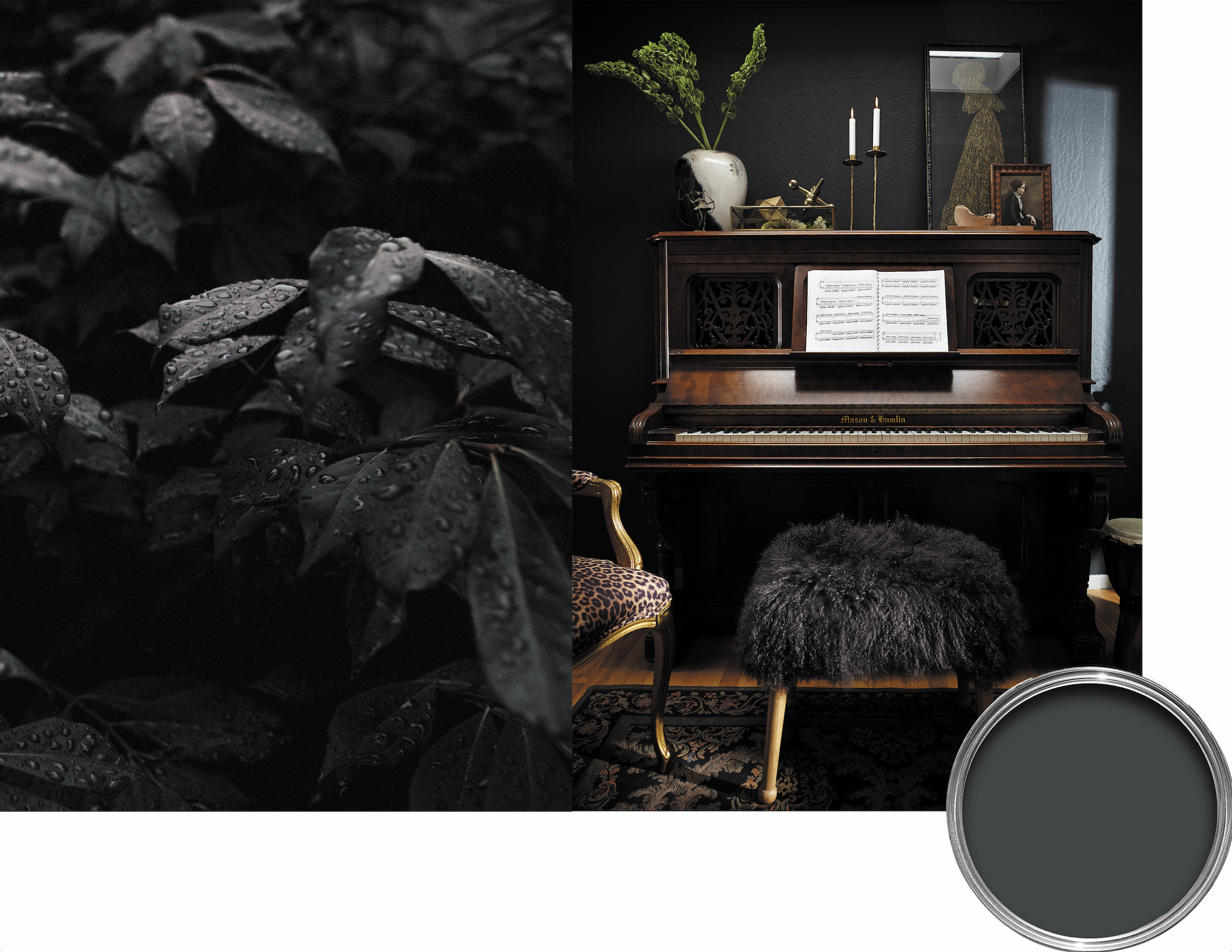
Interior Design by Kristin Riccio Interior Design | Farrow & Ball No. 93
Not quite green, not quite grey - this deep, dark green appears almost black when not well lit and is perfect for those embracing the season’s moody vibes.
8. Tar
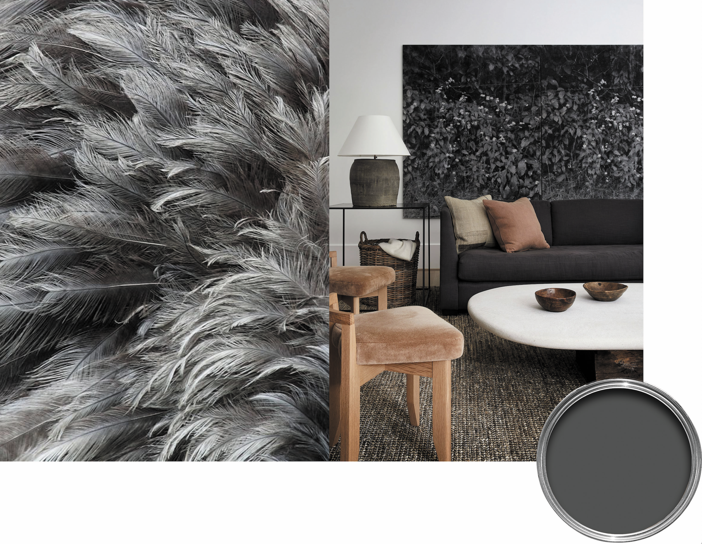
Interior Design by Brandon Fontenot | Farrow & Ball No. CC1
This smoky hue is a saturated yet soft neutral that adds an air of sophistication and warmth to any space. The color compliments warm wood tones and acorn colors beautifully.
Whether you’re giving a room a fresh new look or adding seasonally appropriate touches to an existing space, it’s hard to go wrong with a fall color palette. Take a cue from nature and reach out to our team, we’d love to hear how the season inspires you!